Balance skin
Packaging Design

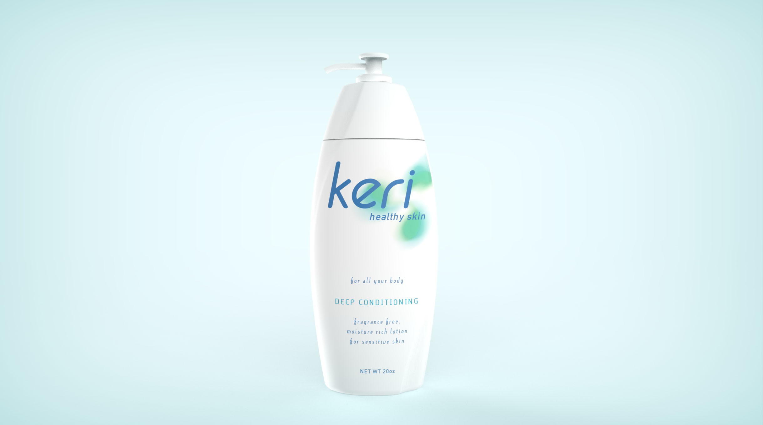
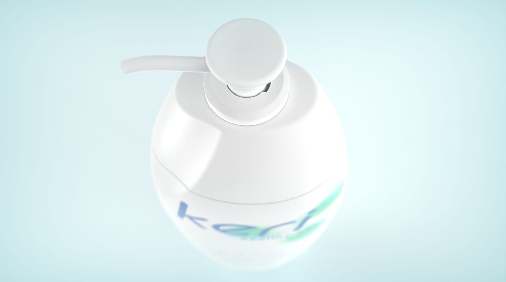
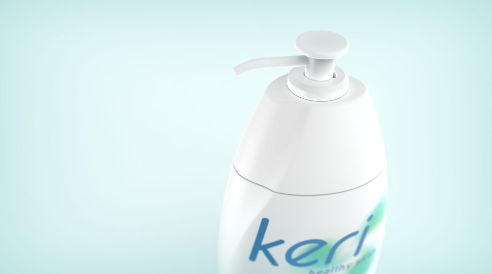
The Keri band has a substantial market value of therapeutic reputation. However, the brand faced the challenge of low recognition among new and young customers not. The strategy was to connect with younger customers while not alienating their existing ones. The idea was to promote an image of balance and healthy skin. We design the lotion bottle with a smooth and continuous form. The brandmark's gentle yin and yang curve reinforces the notion of balance skin. The new design uplifted the brand image and successfully connected to new and younger consumers.


